There are a huge amount of websites with different web designs. Everyone wants to have an attractive website to be interesting for visitors. There exist certain design fundamentals which help to create a website that shines and sparks. Although there are studies behind those principles and their usage, we have to keep in mind that it is also very subjective. There are many factors coming into the process of designing so to deal with them it is great to familiarize with design theory concepts and terminology.
Among many of the principles these are frequently used:
- Color Theory
- Typography
- Iconography
- Interactivity Design
- Animation Design
- Visual Hierarchy
- Scale
- Alignment
- White Space
- Contrast
- Responsive Design
Eyes of the user serve as a scanner of a page. The user goes mostly from left to the right and then top to the bottom and again horizontal and it repeats. This is called the F-shaped pattern for reading/seeing web content. Eye-tracking technology is used for such experiments. The web designer should implement this knowledge and apply it during the designing process. Thus to design a web it is crucial to pay attention to the research and studies surrounding human-computer interaction.
In most cases when a user enters the website, the first fundamental which shapes her or his experience is a color.
As an example we will dive more into the color theory. Choosing the proper color for our design can become a difficult task. We tend to pick a color according to our personal experience and preference. Color is a very powerful tool within visual communication. The choice of it has an impact on the user's emotions, mood and behavior. Color is an indispensable element in human-computer interaction. Thus we as designers should be responsible and careful during the color scheme selection and treat them with care.
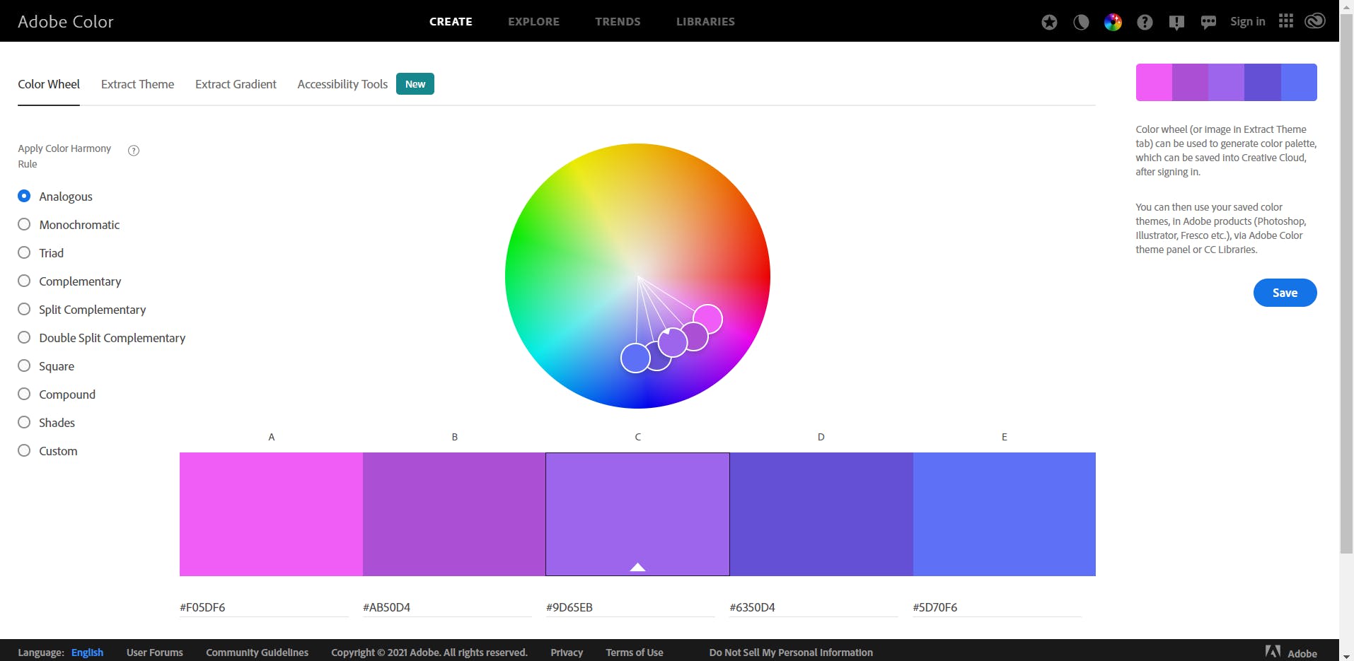
Color theory focuses on color combinations which are balanced and effective. As there are many options on how to combine colors, this theory helps us select the ones being in harmony and powerful for our work. One of the recommendations is to keep our palette simple and use a maximum of three colors. Trust me, it is enough to create fabolous color variations if you just play with the tints or shades of those colors. Another important advice is to understand color wheel.

That refers to the process of how to pick colors. You as a designer should get familiar with terms: primary colors, secondary colors and tertiary colors. Through a color wheel you generate color schemes (e.g., complementary, analogous, triadic, monochromatic).
The very important part is also what role psychology plays in the selection of colors. We as designers affect the user's human brain by the color we choose. Imagine that as we design we communicate with the audience (users), we use visual language, we want them to use their senses, we want them to feel the experience. Colors are extremely powerful tools and should be treated properly with care ❤️🧡💛💚💜💙🖤
